Webesthetics ©
The art of book making, or of any readable/visual material is about visual interest and ease. I can't count the number of web sites I've visited where the choice of typography and the spacing between lines of type is entirely uninformed, or where the design of the web site is uninformed. The options available for type on this site are limited, also, and that is frustrating.
The more we spend time reading things on computers, the more visual ergonomics is going to be a crucial issue.
What is wonderful about a two-page book that was well designed was that facing pages were harmonious--so one could read one page without being distracted with what was on the facing page. Furthermore, a two-page book allowed one to have one's eyes shielded by extraneous visual data about one. Not true for web pages, Kindle, or any of the new computer formats. Even if one views things that are set up as a two-page spread, the pages are flatly presented, so visual distraction is easy.
Remarkably enough, many companies have designed their web site with equal horizonal strips, and there's no where for the eye to decide where to go. The design is visually tiring, even a little irritating.

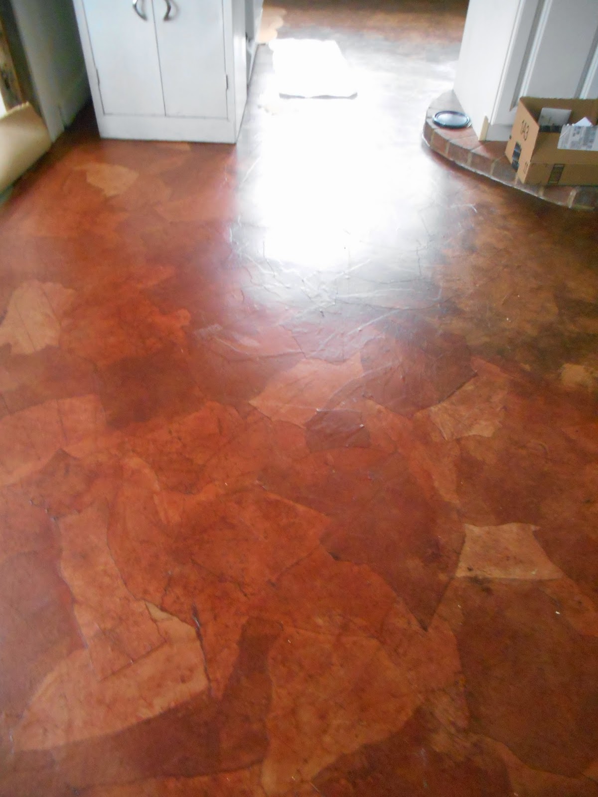
Take the first picture provided with this entry. The material is visually pretty, but the dark area below and the light area above are almost equal in size, and my eye can't find a place to rest. I'm straining, really, to see what is in the dark area. Straining is the key word here. I can crop this photograph to make it more visually aesthetic, as in the next image.

My goal is to bring a history of book and other visual experience to the web. Aesthetics is an art, one that begins with training and develops via passion and a natural propensity toward beauty.
The more we spend time reading things on computers, the more visual ergonomics is going to be a crucial issue.
What is wonderful about a two-page book that was well designed was that facing pages were harmonious--so one could read one page without being distracted with what was on the facing page. Furthermore, a two-page book allowed one to have one's eyes shielded by extraneous visual data about one. Not true for web pages, Kindle, or any of the new computer formats. Even if one views things that are set up as a two-page spread, the pages are flatly presented, so visual distraction is easy.
Remarkably enough, many companies have designed their web site with equal horizonal strips, and there's no where for the eye to decide where to go. The design is visually tiring, even a little irritating.

Take the first picture provided with this entry. The material is visually pretty, but the dark area below and the light area above are almost equal in size, and my eye can't find a place to rest. I'm straining, really, to see what is in the dark area. Straining is the key word here. I can crop this photograph to make it more visually aesthetic, as in the next image.

My goal is to bring a history of book and other visual experience to the web. Aesthetics is an art, one that begins with training and develops via passion and a natural propensity toward beauty.

Comments